Hatton National Bank
Creating a “No-Wait" banking experience
2020
Experience Design
About
Hatton National Bank is a 140 year old Sri Lankan banking institution. With 250 branches and 500 ATMs all over the island, the brand is well known and loved by older generations, but needed to evolve to keep up with the competition, and appeal to younger Sri Lankans.
Interbrand Mumbai had already worked with HNB to refresh their visual identity, but wanted to refresh their branch experience to match. As the retail experience designer, I was tasked with re-designing the bank, but more broadly re-thinking the role of the bank branch in an age of digital transactions.
Customer Study
Along with the client, I visited 16 different branches across Sri Lanka, to understand their current approach, what works, as well as the different types of customers and transactions.
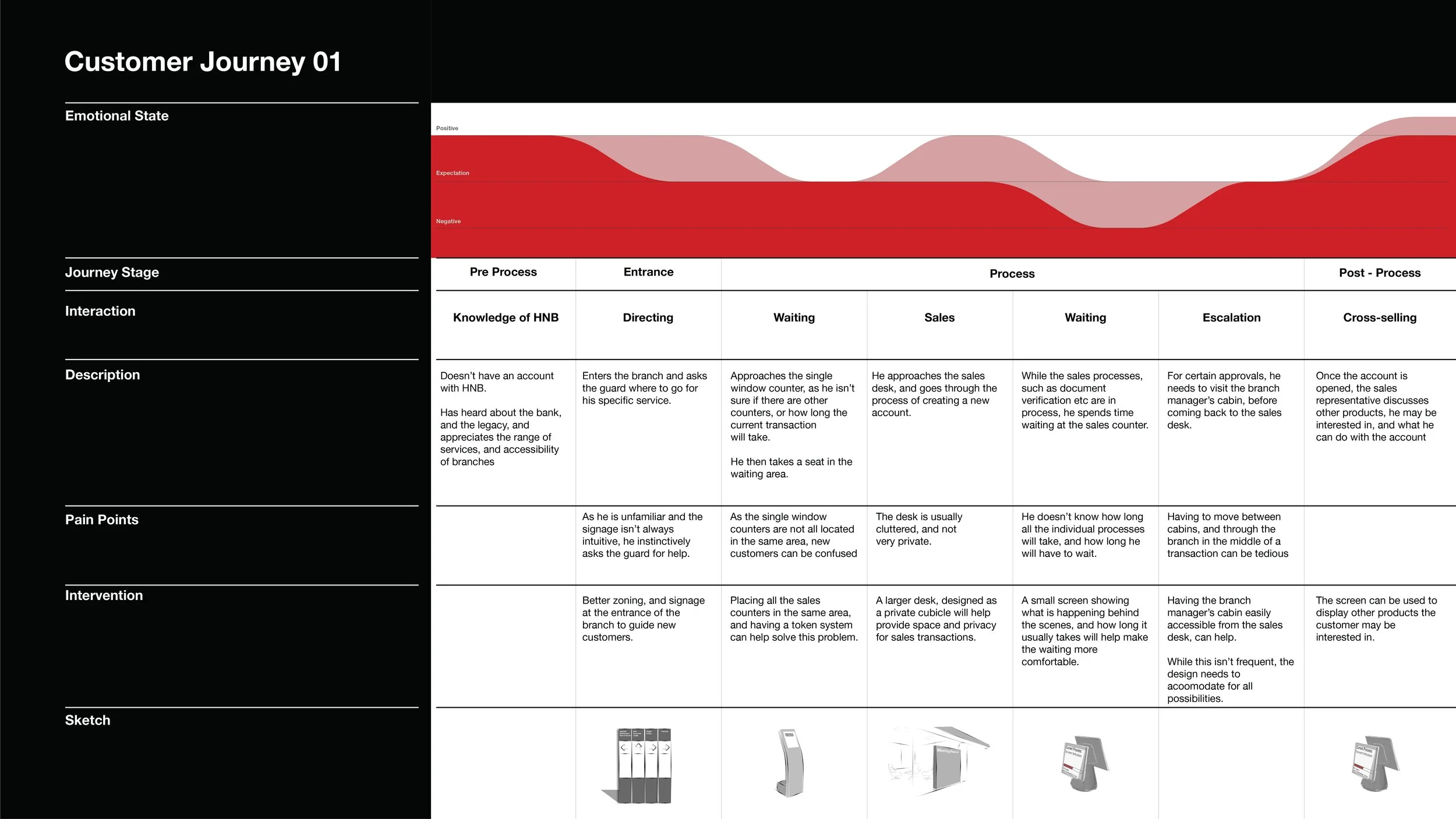
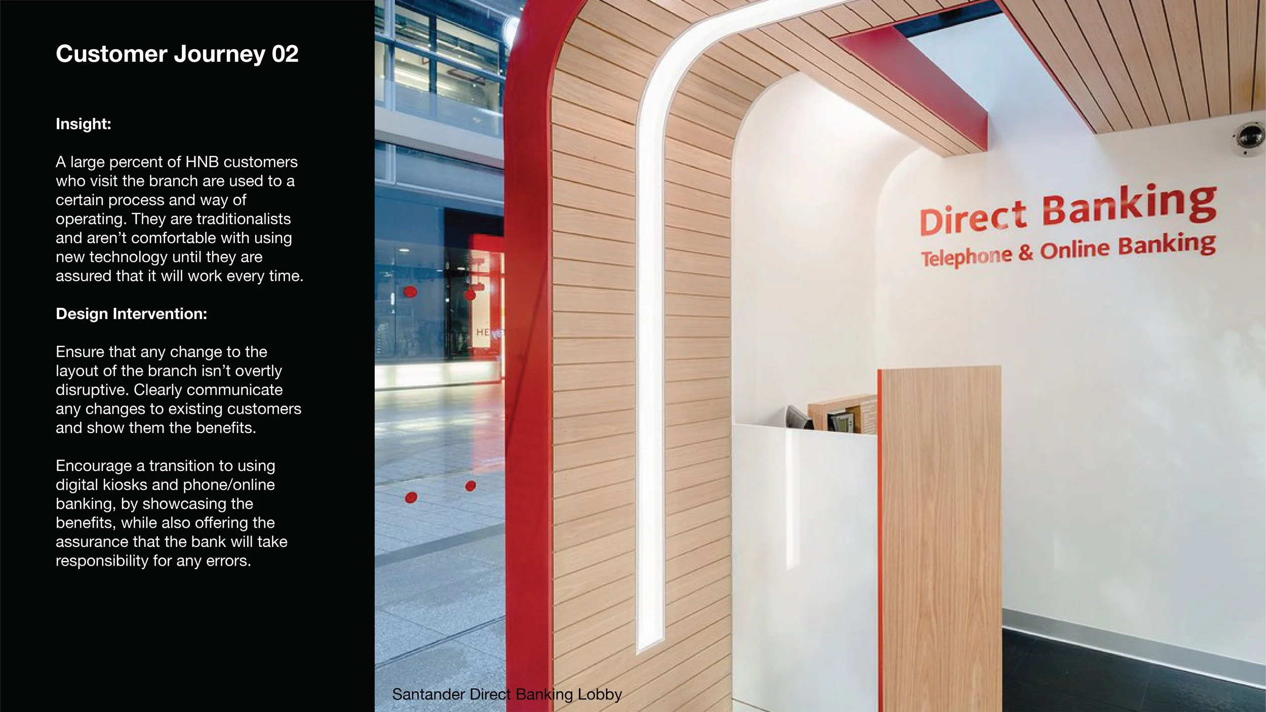
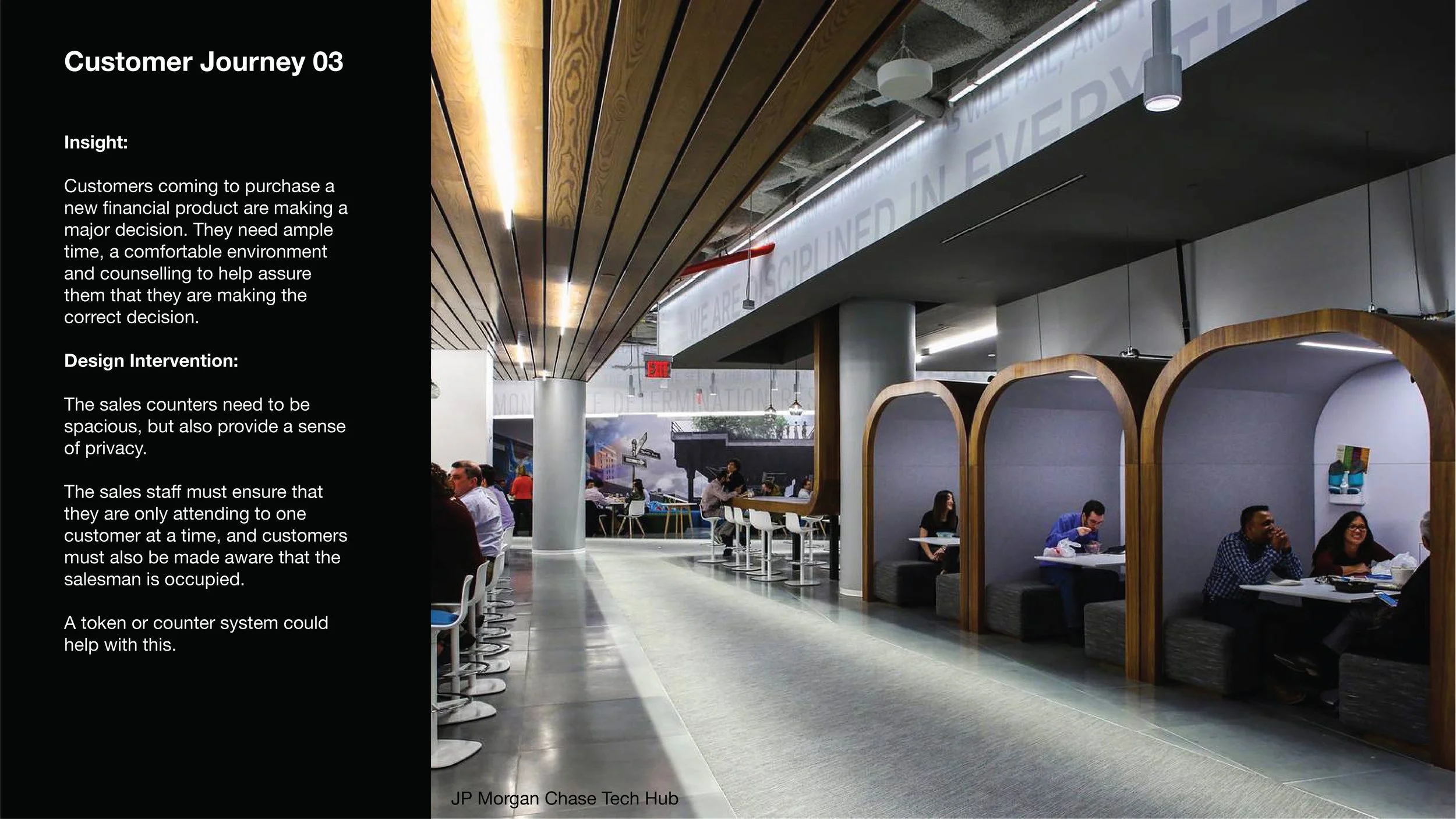
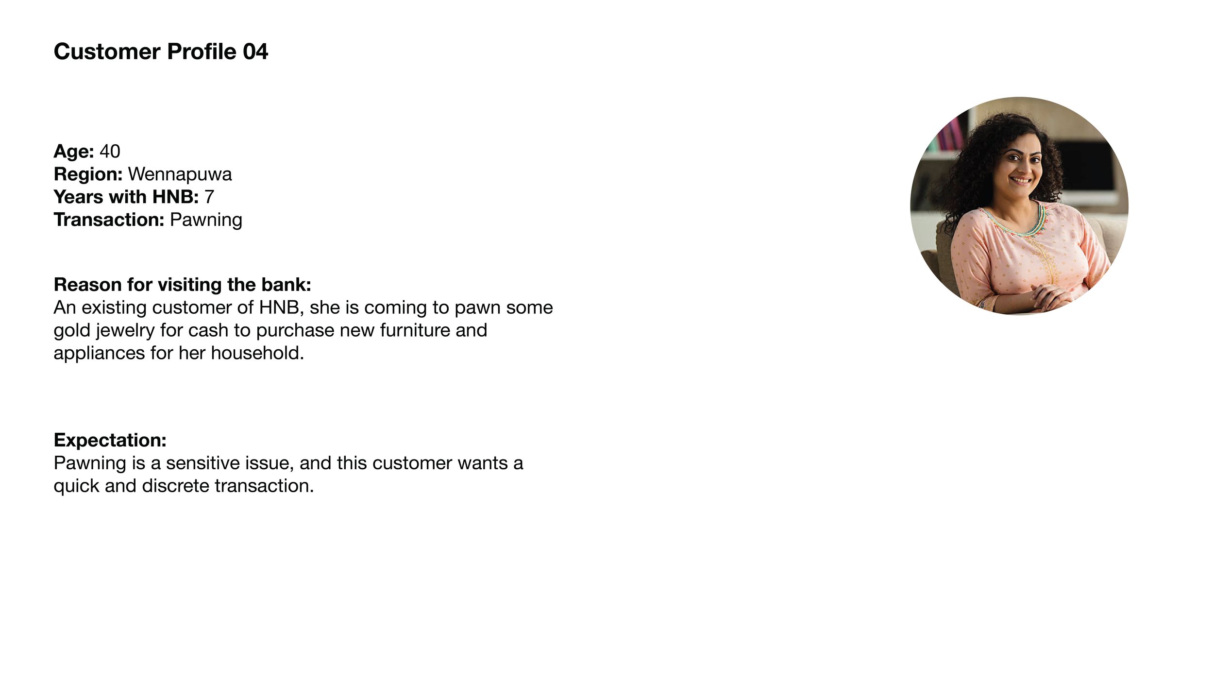
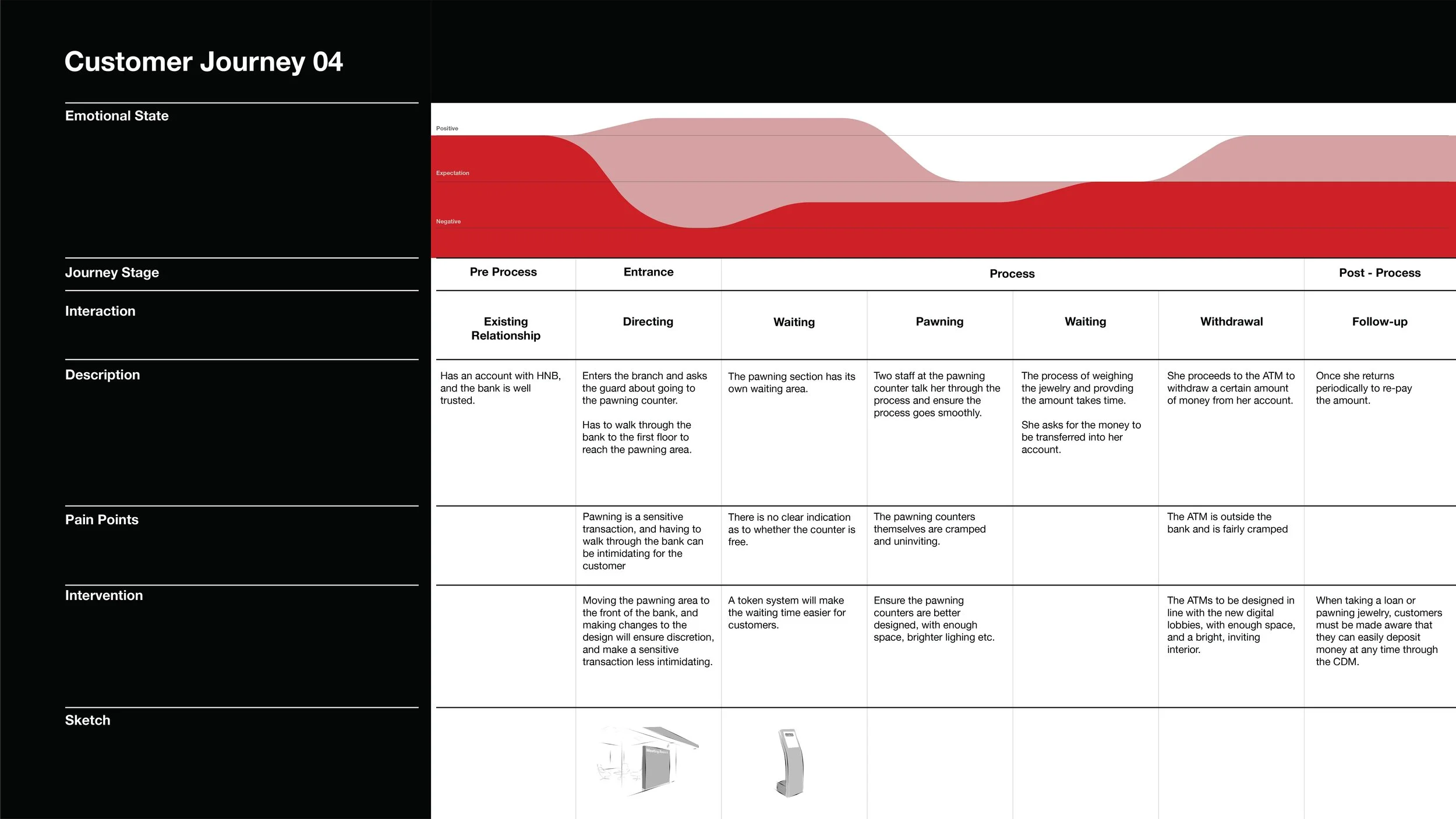
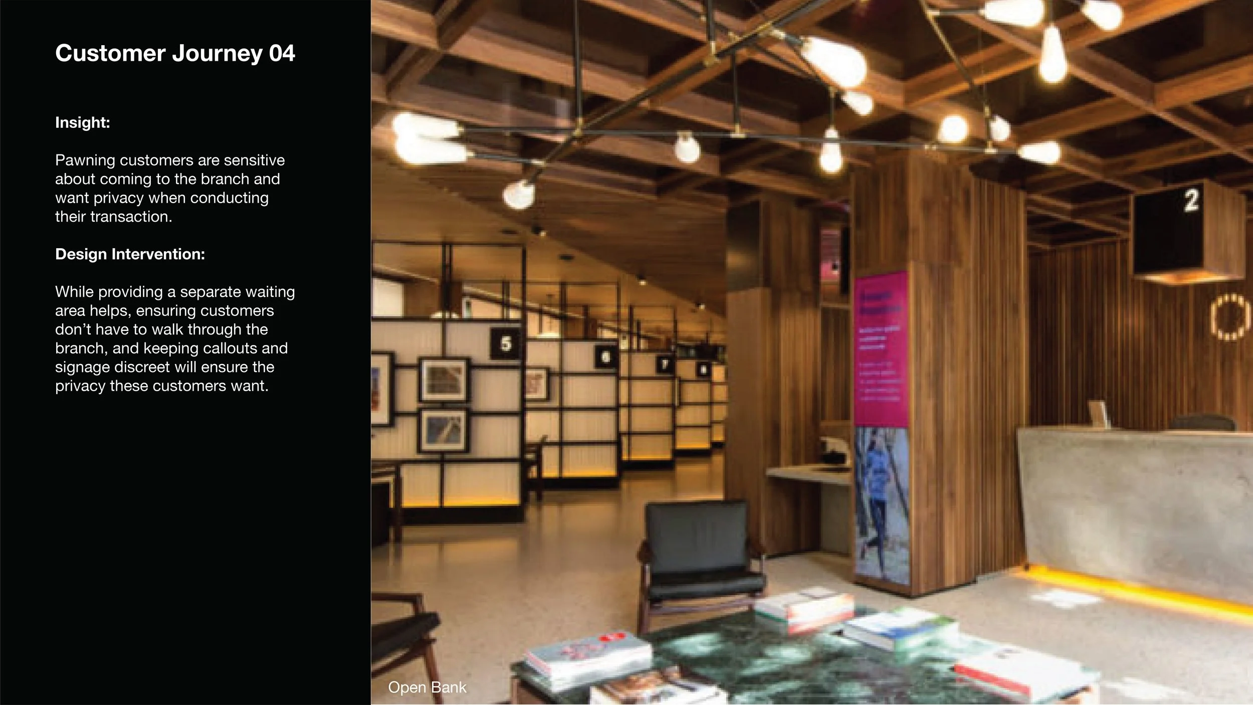
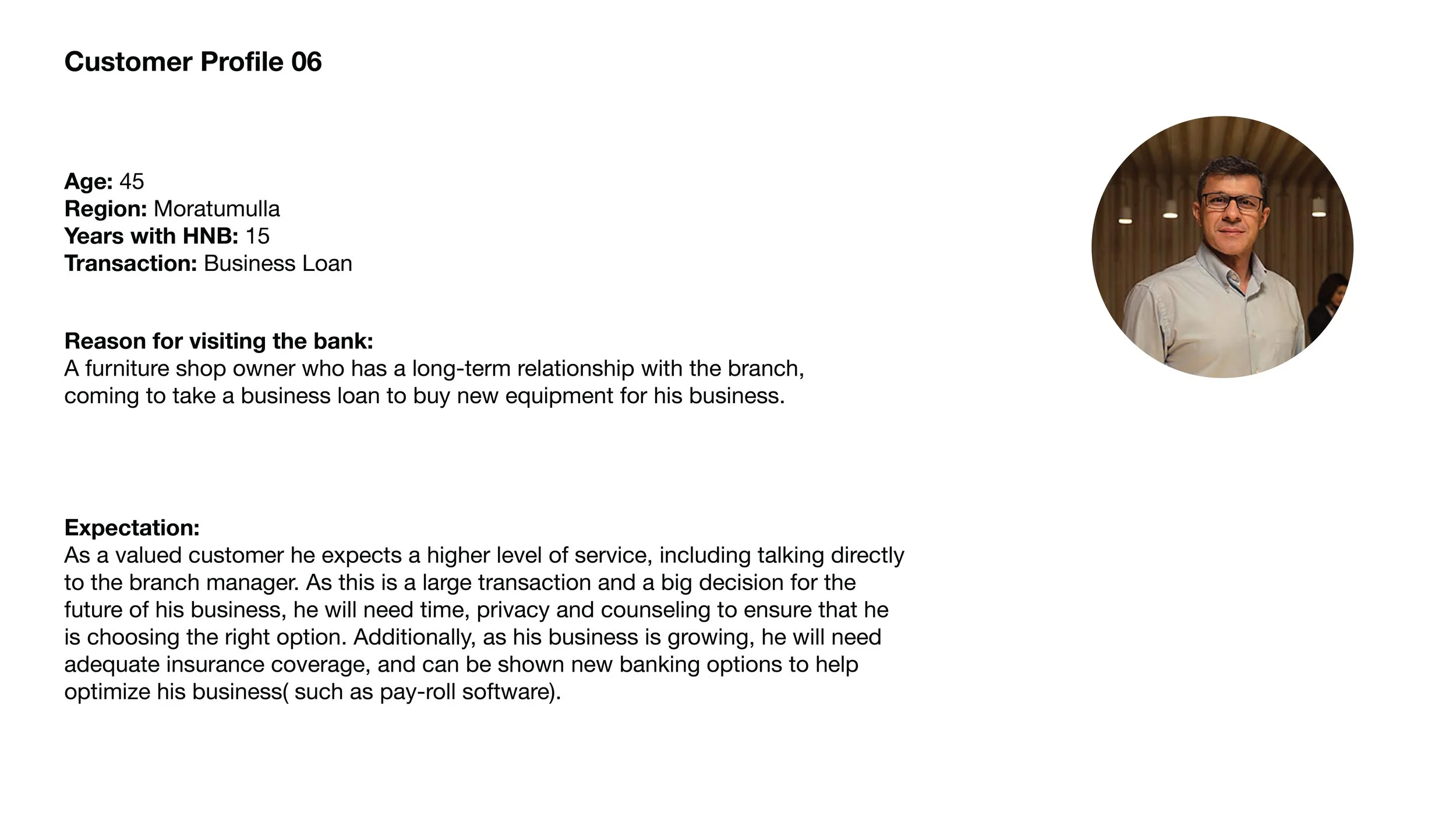
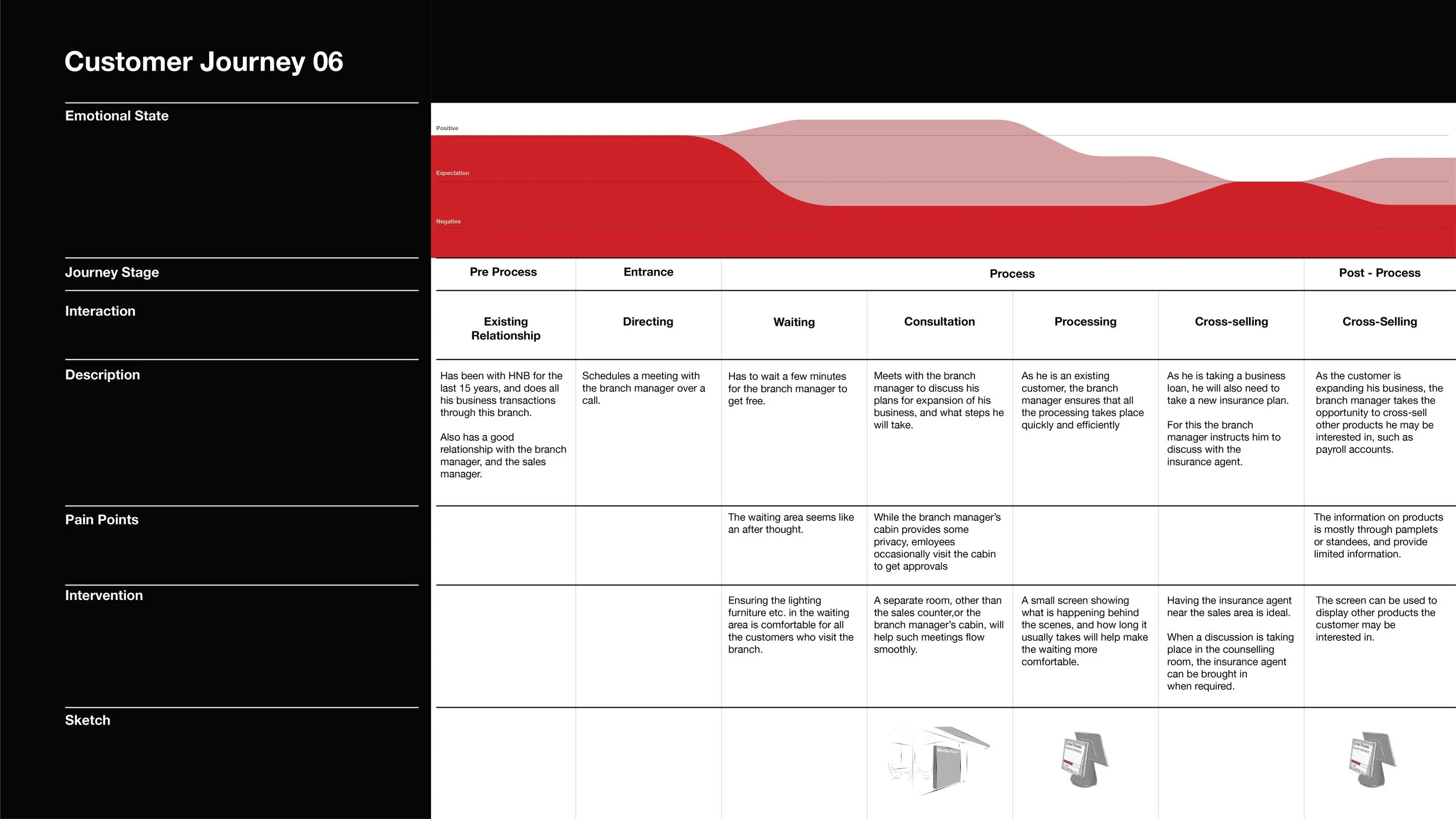
This information was then plotted into 6 different customer journeys, to understand what are the pain points for the customers, and how they might be addressed in the new design. These were paired with best pracitces in the space that addressed similar issues.
Human Truths
The insights from the primary research were combined with a set of “Human Truths” gleaned from secondary research. The combination of primary and secondary research were essential in ensuring that the impact of biases from either mode were minimized.
The Impact of Waiting Time Guarantees on Customers' Waiting Experiences, Kumar et al, 2005
01
02
03
Bank customers would like to complete their transactions as quickly as possible.
Reducing the pre-process wait time will have the biggest impact on customer satisfaction.
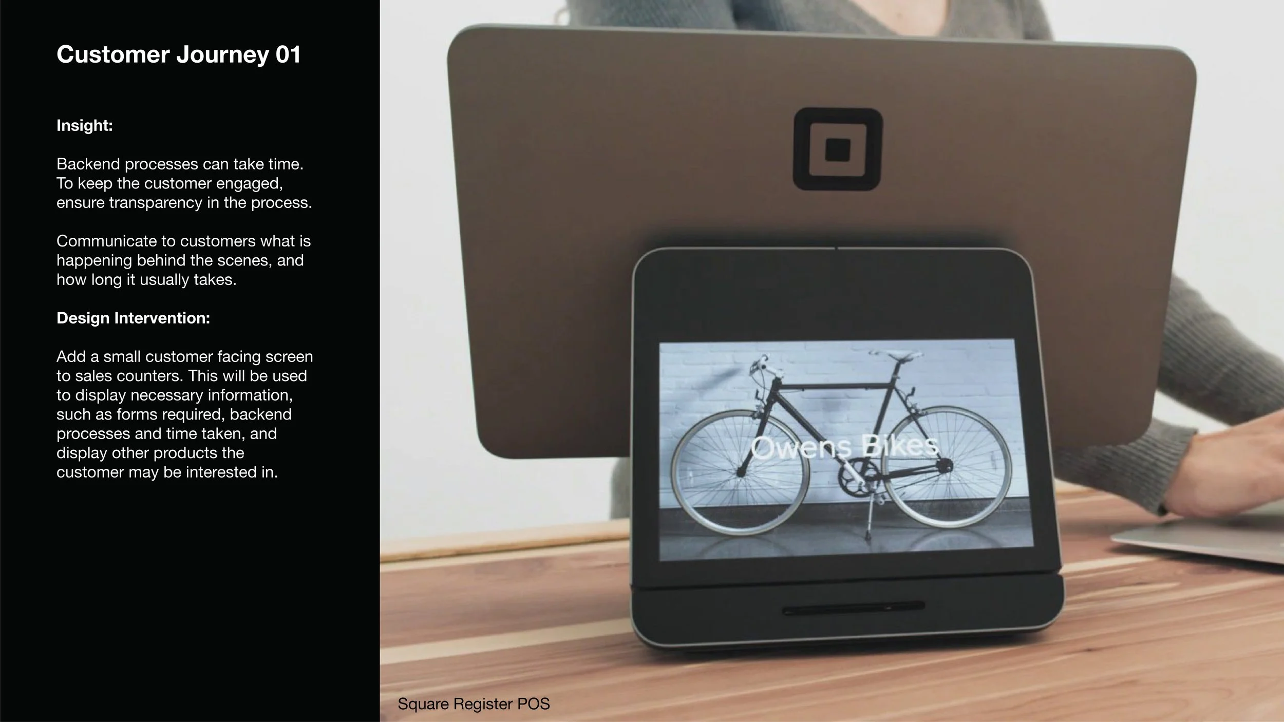
Improving the transparency of back end processes while waiting will significantly improve customer’s perceptions of their wait time, and their overall satisfaction.
While solving problems at individual touch-points can help, elevating the entire customer journey requires a cohesive concept that encompasses the entire branch.
The branch is laid out to ensure that every type of customer is properly catered to, and every customer’s journey flows naturally. Additionally every interaction space is designed for that type of interaction.
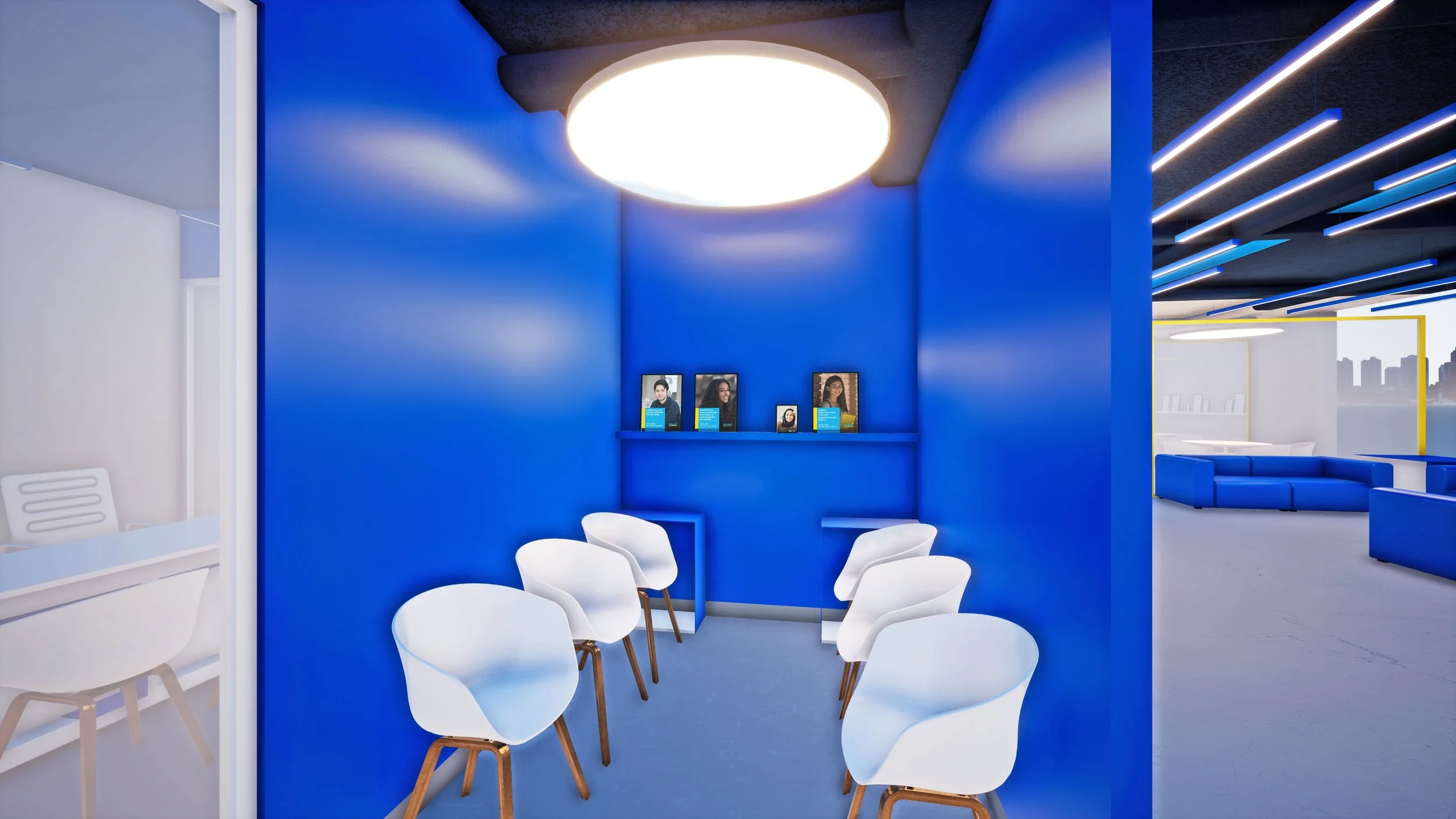
At every stage of the journey, customers are engaged. All their requirements are anticipated, whether big (a private space for discussions) to small (a space to hang their bags).
At no point does any customer feel like their time is unproductive. For the customer, the branch operates and feels like a “No-Wait Branch”
The No-Wait Bank
Re-Thinking the Space
The different types of transactions could be broadly divided into 2 categories:
Quick Transactions and Sales. The planning and design of the space were also based around this division.
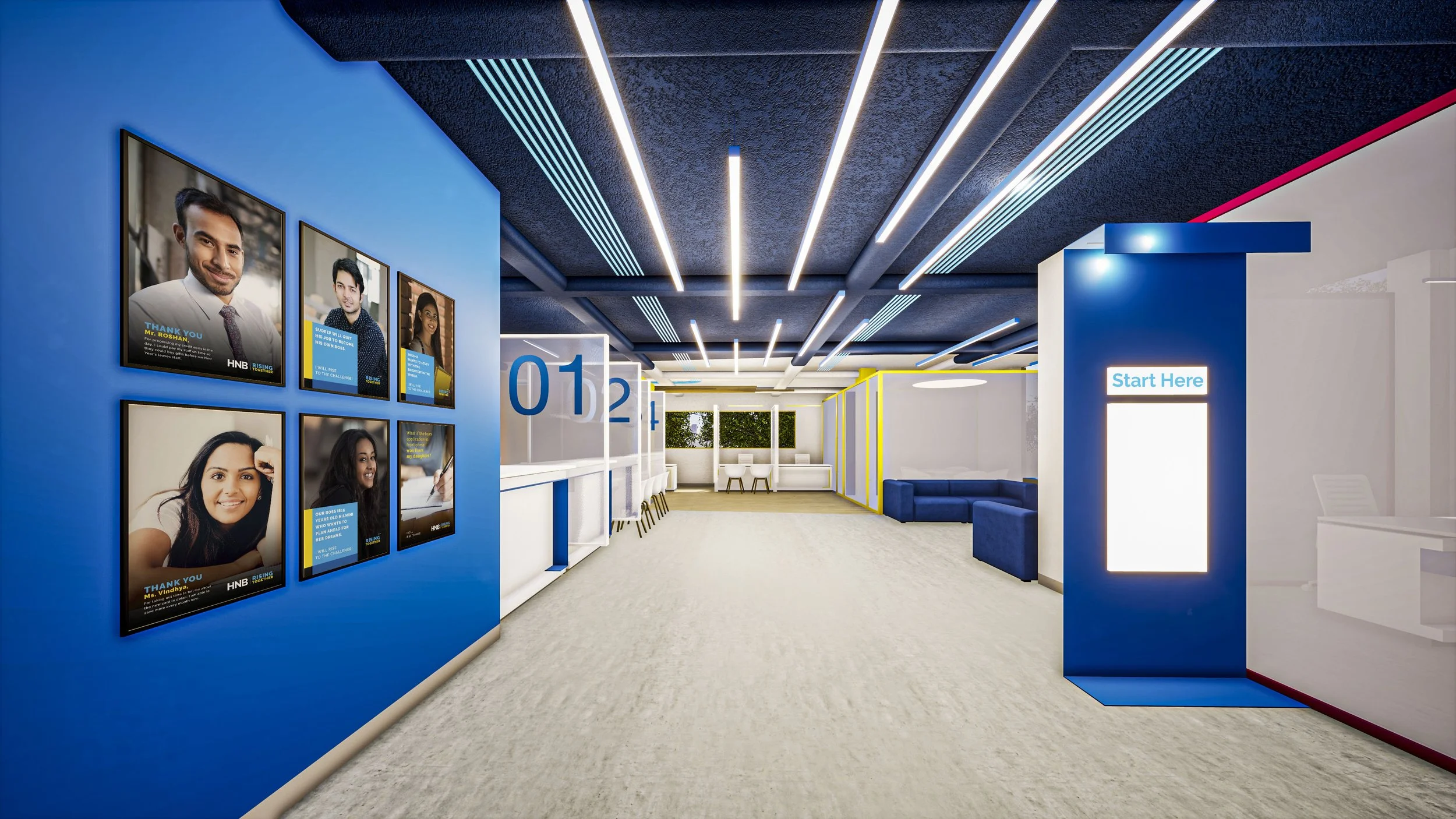
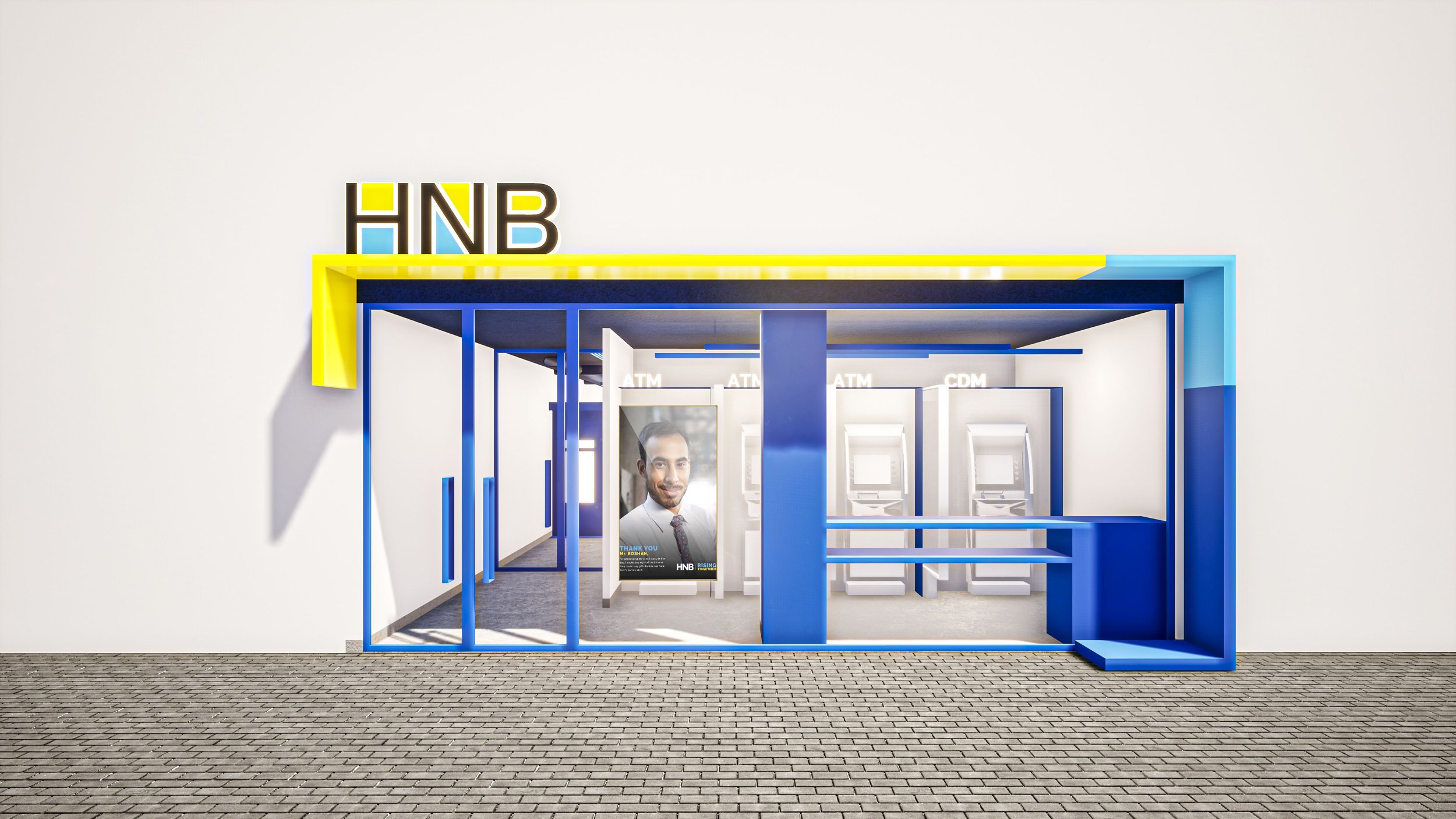
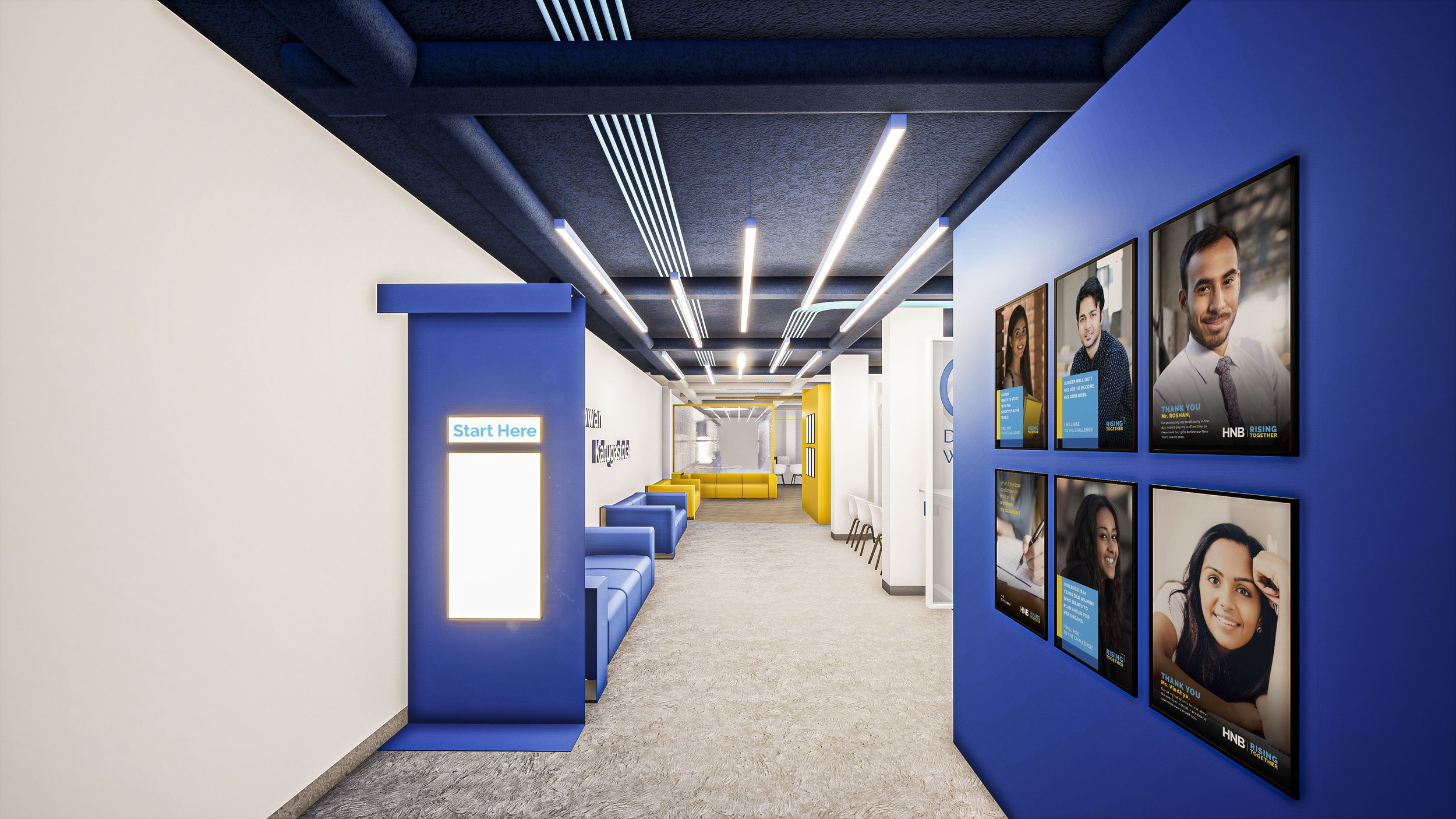
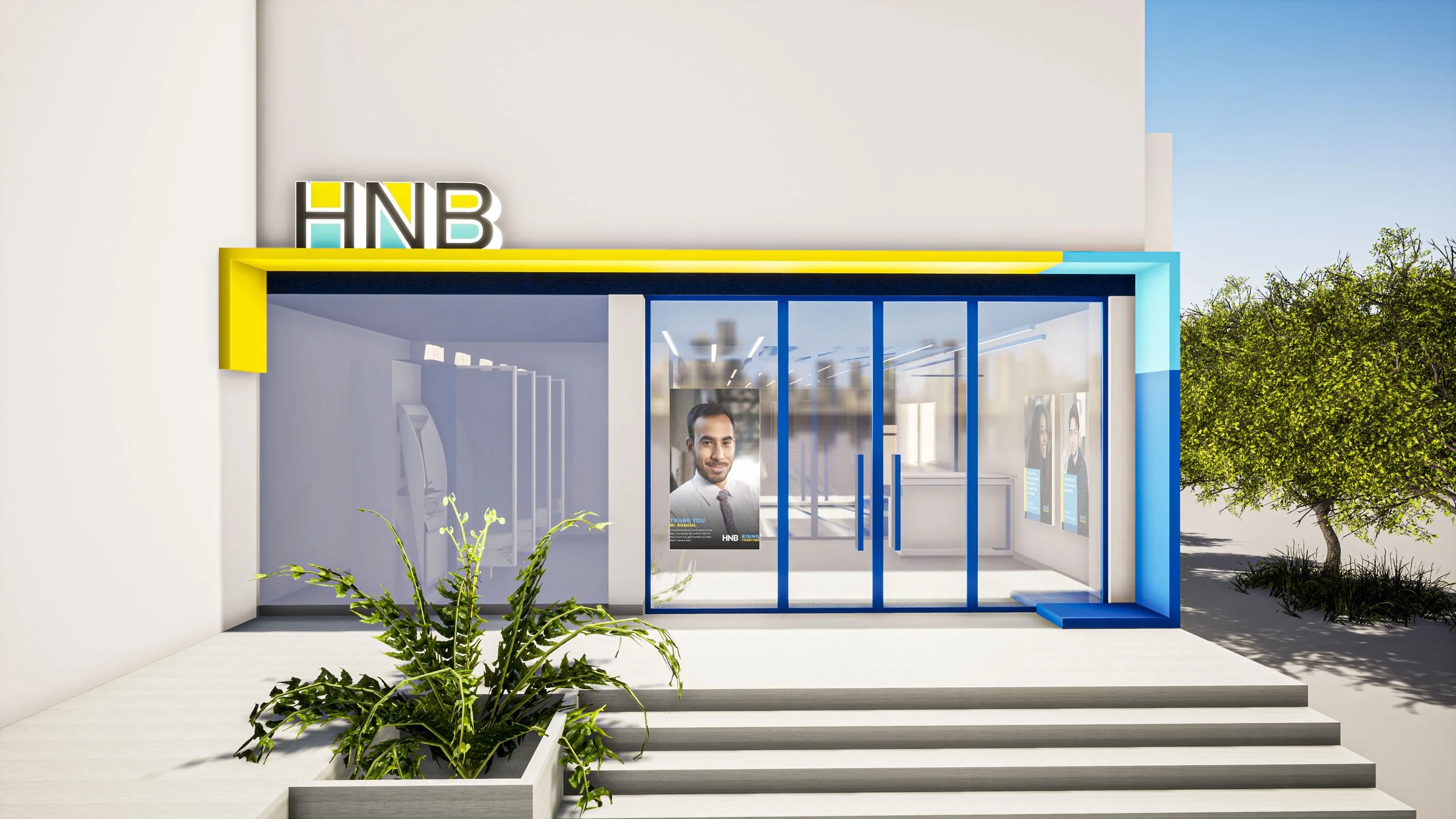
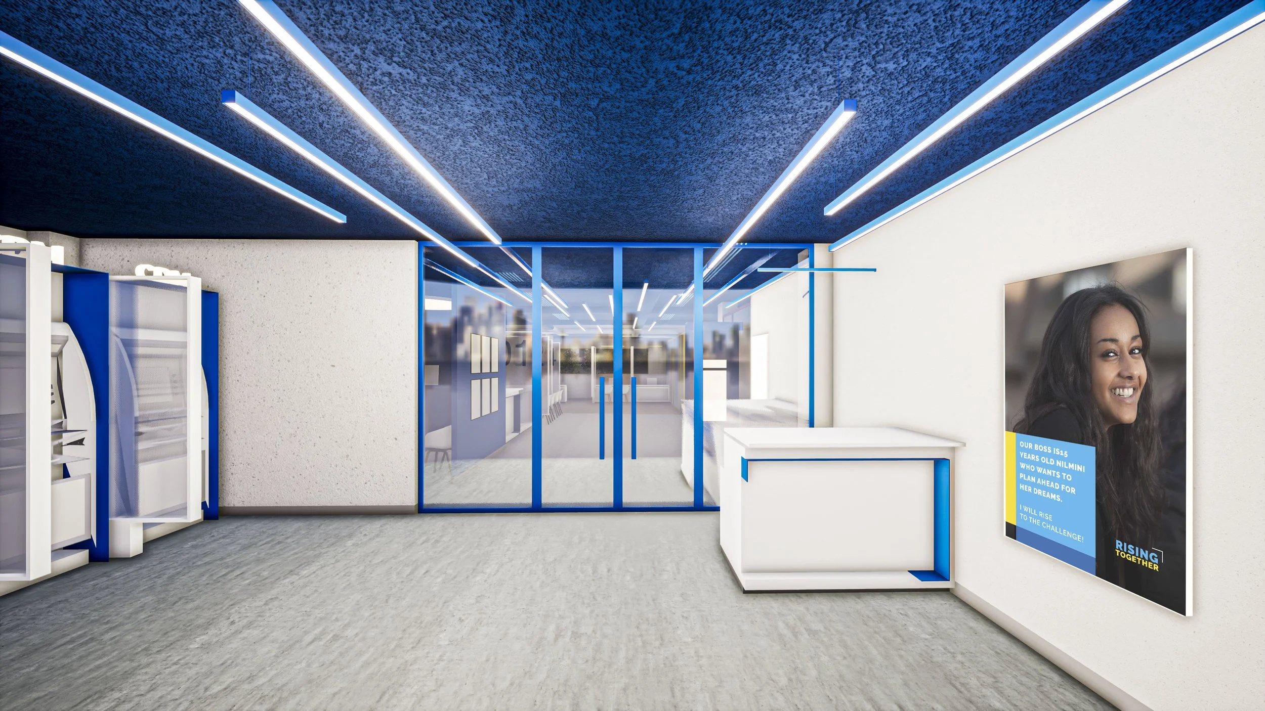
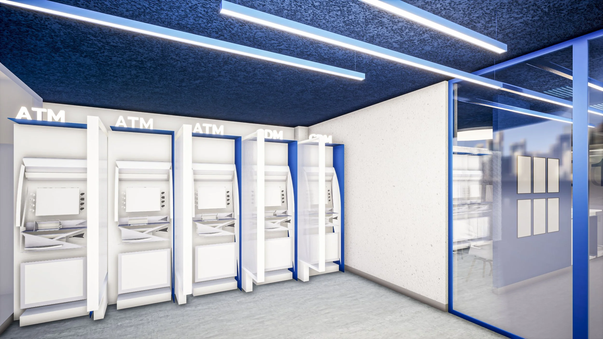
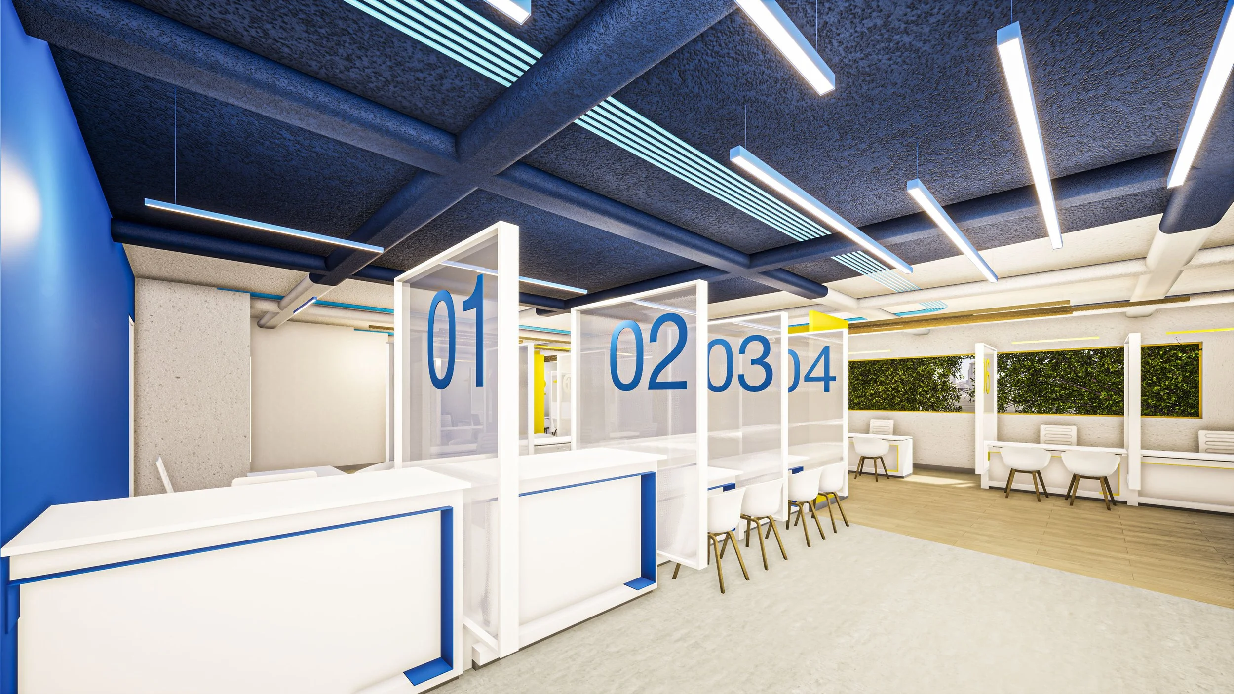
The first half of the space caters to quick transactions. The space has a more commercial feel, with the primary color being the Brand’s Blue. Also included in this space is a digital zone, that remains open 24x7.
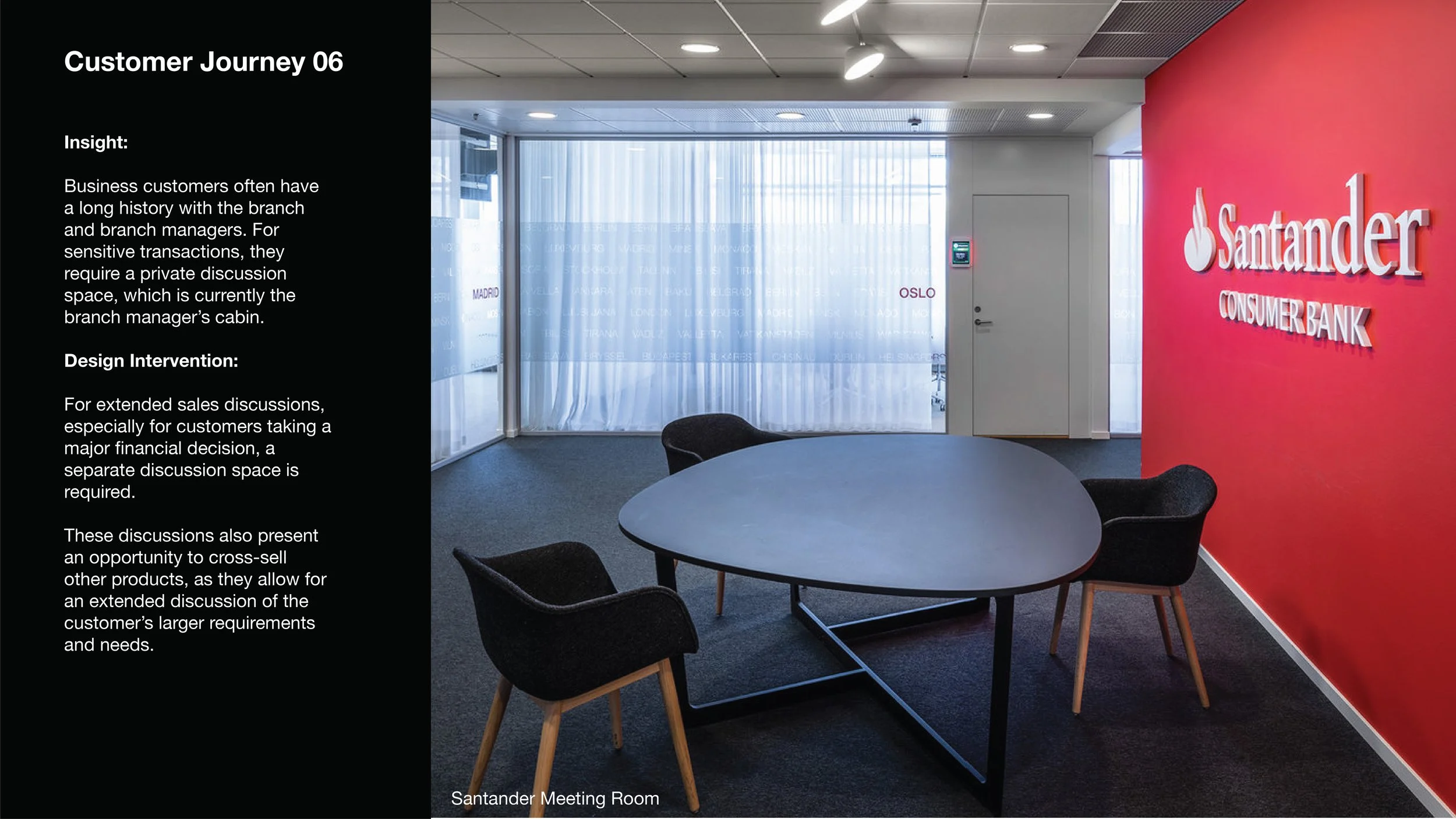
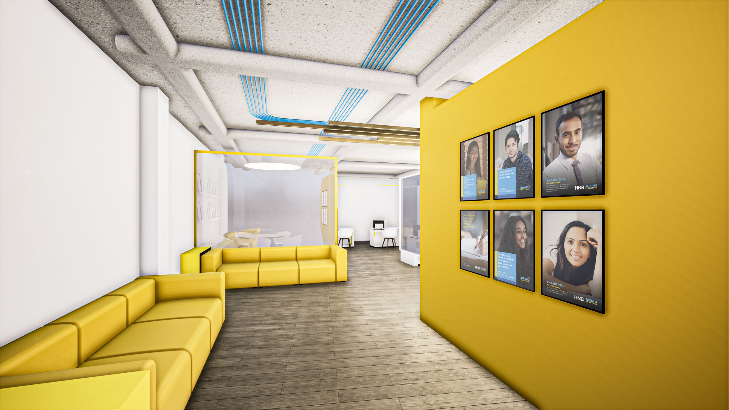
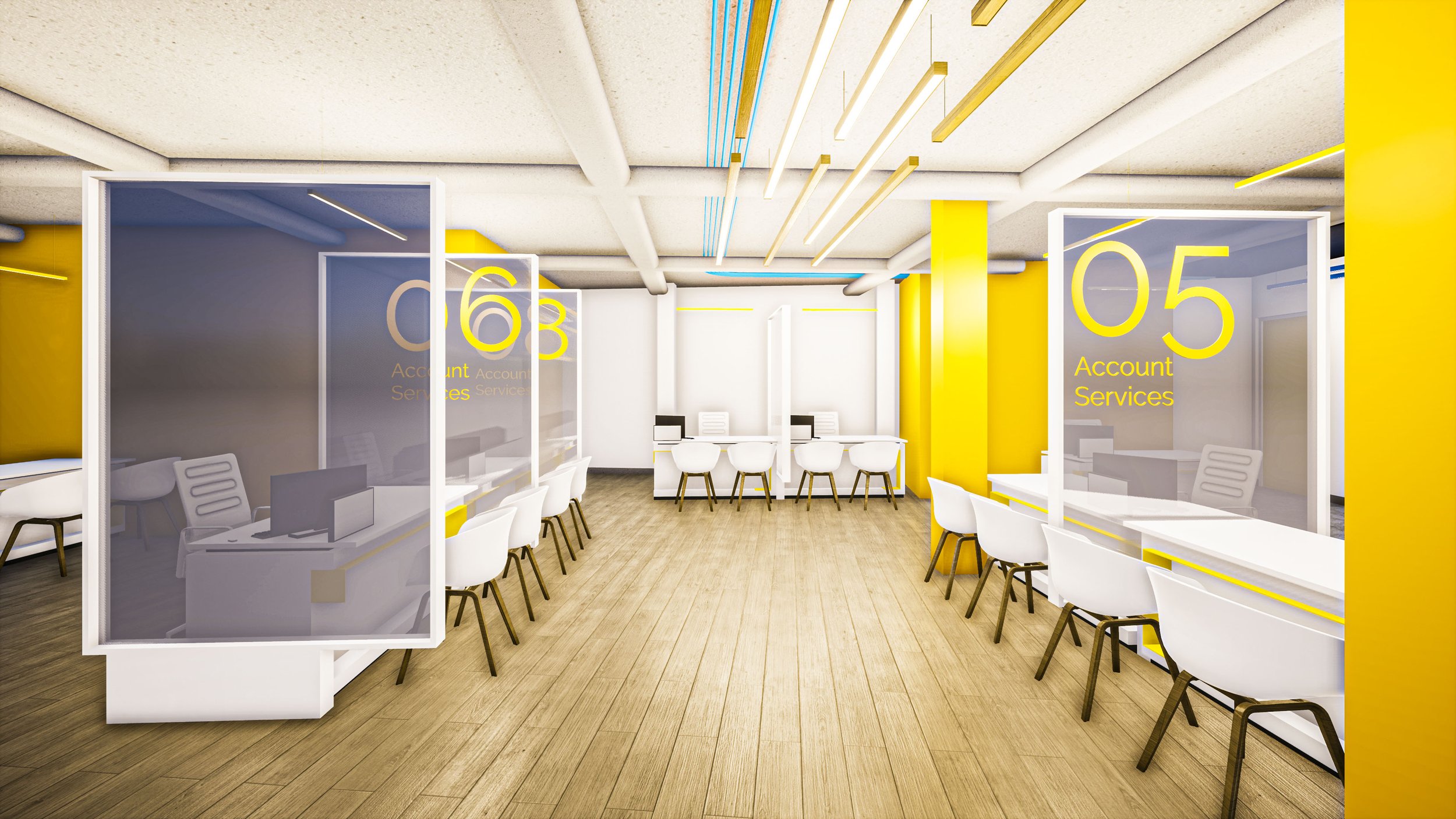
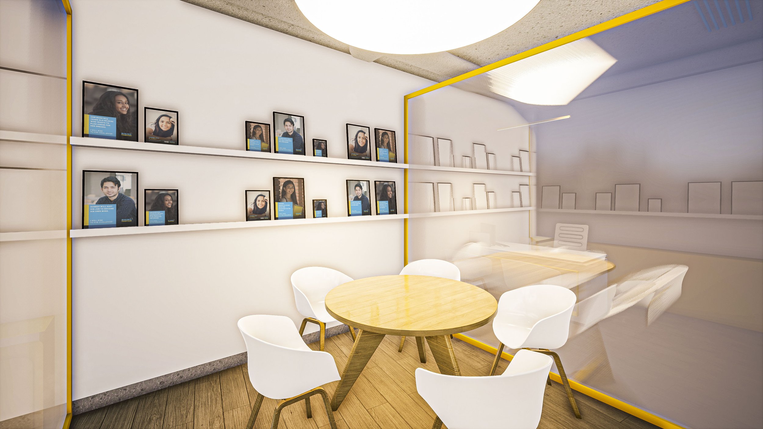
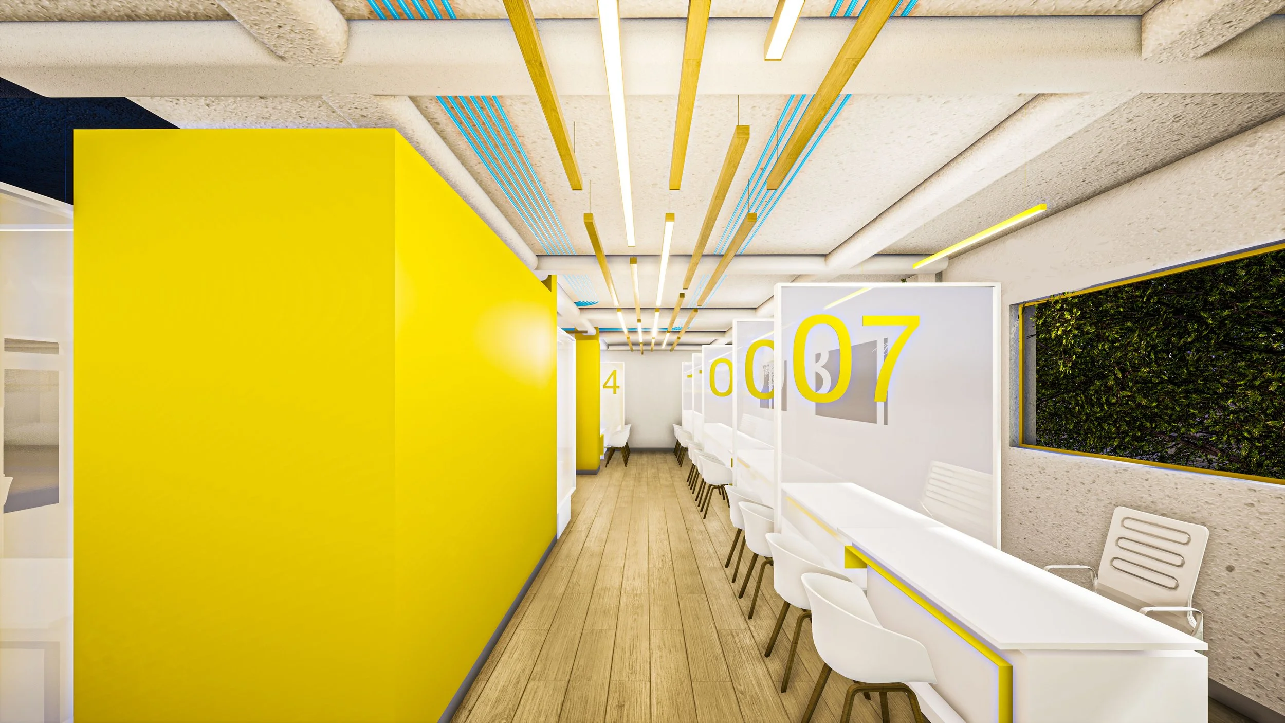
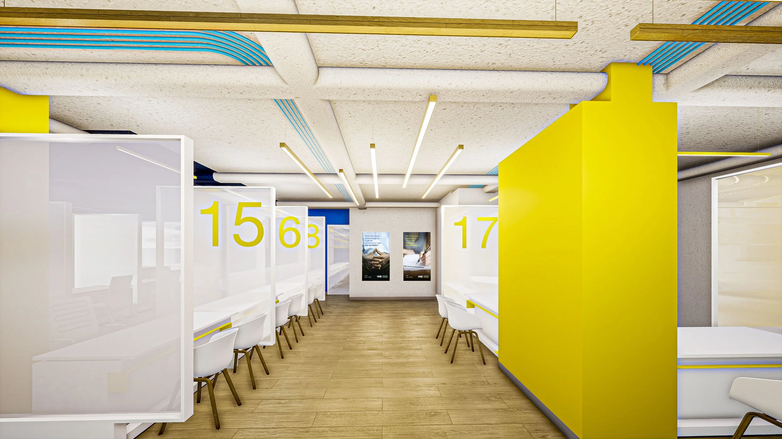
The back half of the space caters to selling new accounts and products. These transactions take longer, and so the space is designed to be warmer and more comfortable, with the primary colour being the Brand’s Yellow. Also included was a separate meeting space, for the branch manager to meet with business account holders.
Site 1: Kattugastota
Layout
Facade
Quick Transactions
Pawning Lobby
Sales Lobby
Sales Counters
Entrance
HNI Meeting Room
Site 2: Piliyandila
Layout
Facade
Digital Lobby
ATMs
Entrance Lobby
Pawning Lobby
Quick Transaction Counters
Lounge
Sales Lobby
Sales Lobby

